Feeds:
Posts
Comments

Wow…

So I was checking my mail on Labour Day, looking through to see if anyone sent me anything interesting when I saw an e-mail notification from WordPress that I had received a comment on one of my previous posts!

Whoa, apparently the author of the Smoke & Mirrors article found out about our assignment and read through the students’ blog entries! Amazing… Well, check out Christopher Fahey’s response below =)

graphpaper.com – A View From Singapore

PS: At the time of this post, I just received a notification from Mr. Reddy regarding the response post.

Hmm… The process matters. Well, I guess that’s because in User Experience Design, where our designs are user-centric and the process revolves around what the user wants, a good process will have to lead to a great product. Well, I guess…

After learning about all the design theories in NM2208 what with Gestalt and the Colour Wheel, we have moved on to focusing on what the users really expect and how to empower them. So this post is supposed to be about my experience with Designing for UX. Ambivalent, I say. Ambivalent because I found the module wonderfully refreshing and confusing at the same time.

So my group (Si Wei, Jeremy, Zhenfeng and myself) initially wanted to do a game as our final project, promoting love for the arts. Well, we got the approach wrong at the start. One of the things that I learnt from Mr. Reddy is that UX Design is NOT about trying to hard-sell to the market a well-designed package of what you think they want. It’s about giving them what they really want, with added value and bells-and-whistles. I remember our group consulted him for a long period of time as to how we should go about approaching the project. One of the e-mails which he replied provided a very refreshing insight to creating user experience…


“Difference between functional service vs a service which has potential in creating positive experience. i’ll give an example – flying by singapore airlines vs Air India. Cost of ticket is same, aircraft is same, but experience is very different.

One airline understands what their customers need and value. Other one does not.”

I’ll remember this.


I learnt the various ways to go about doing research and analysis to better our designs to invoke that user experience. Apart from card-sorting which we picked up in NM3208, we also dealt with laddering, pleasure analysis and various forms of probing (Okay only 2, Cultural and Technological). Concepts are boring by themselves and for me, it was a chore to have to learn about them. But I realise that only through applying them then do I see their usefulness and how helpful they can be. Laddering sounds like one of those irritating pranks which we play on our friends, probing them with tonnes of unreasonable “Why?”. But if we know how to wield it correctly with appropriate questioning skills, we can truly gain insights to the roots and fundamental of problems that will aid us in user experience design. Research matters and they are all not just smoke and mirrors. One just has to know its limitiations and how to go about conducting them fairly. That’s tough and that comes with great experience.

User experience cannot be created. Though I was confused a bit here and there between creating and invoking user experience, I think I got it. Here’s an analogy: It was a great experience taking NM4210 because the students’ were given the appropriate amount of freedom, with guidance to approach their projects and assignments whereas some other NM module which I took was bad because even though we got to produce some amazing products via our projects, the lecturers, criteria, guidelines were strict and suffocating and had no idea how and what the students desired to learn from their module and the entire process and experience was, the least to say, excruciating.

That said, I think some other lecturers in NUS should learn to take a page from Mr Reddy’s teaching style =)

The Article – User Research Smoke & Mirrors

I think I understand the title of the article. A metaphorical term used in magic tricks to connote the idea of deception. It’s “smoke” because it refers to the vagueness and haziness of user research. “Mirrors” refer to a reflections and illusions of research.

***

User research as a tool, as a weapon is something that is being employed as a marketing tool. How our crafty statisticians wield the numbers to reflect what they want as opposed to what the situation is like is not something unheard of. Either that or people conducted ‘safe’ researches within constrained boundaries, which as I agree with the article, might as well have not been conducted at all. I mean, what’s the point of trying to find out more details from a small group if your product was meant to serve a larger group?

***

The next part of the article talks about eyetracking which I found rather humourous, especially that part where eyetracking studies can’t reveal if people stare at your page because it’s too complex or too interesting. Maybe the idea is that “Who cares so long as they are fixated on it?” In the end, it’s just a matter of where the eyes focus and more analysis and research needs to be done before we can conclude anything concrete from the eyetracking results. Heck, it may not even be a design problem and people may simply be fixated because they stare at the word “Supercalifragilisticexpialidocious” and have no idea what it means.

***

User research as politics, as the obvious way of informing others on the influence and effects of a certain design is refreshing to me. Maybe it’s because I have learnt, via NM2208 =), the fundamentals of a good design and so I can roughly tell if something is of a good design or not. Well, my take is hire a down-to-earth design expert and trust his views. But then again, that’s just my take…

***

I didn’t grasp the “wrong-ness” of the Persona Room concept till the author explicitly stated and questioned whether it was all worth it! For what it’s worth, we can only pray it was damn worth it, haha. I agree that real stuff is messy and imperfect and researches should not be the be-all-and-end-all of design. After all, if research was all we need, then anyone who can conduct a good research can do designs! Who needs a good website or graphics designer with ideas and talents? Not.

***

So to sum it all, user research matters but it’s not EVERYTHING. The final product and how it is judged by users is what counts. Get feedback on that and refine it too, not just base everything on statistics and potentially-biased chart. Like everything else in life, we have to learn to strike a balance, a balance of research data and actual work =)

On Bus 54

This event took place 2 weeks ago. I thought I will blog about it since well, it’s related to user experience =)

I was waiting for Bus 54 at the bus stop outside my place. When the bus approached the stop, I noticed it had an unusual bus plate design. This I noticed since I have taken this bus many a number of times. When I stepped up the bus, the first thing I noticed was its interior design. Yes, the local public transport actually had an interior design! Wow!

It had cushion seats in sleek white that ran around the edge of the bus. Some parts where there was no cushion seat, there were armchairs instead. Armchairs of those type where you had nice arm-rests and could lounge in. The concept of the design was to make it like that of a classy bar. There were even tall chairs and a bar counter look-alike (Just the tall table) at one side of the bus. Contemporary pop tunes (At that time, it was Jet‘s Are You Gonna Be My Girl) was playing away in the background adding to the sensuous mood of the bus. This was not a bus, this was a classy wine bar on the move!

A lady in black got on the bus. I was sitting on one of the white cushion seats near the exit and saw her approached my direction. At that time, the bus was fully seated and there was one or two standing passengers. She walked down the length of the bus, from the entrance to the exit. I couldn’t take my eyes off her. When she finally passed me by, I took up the courage and stood up to give my seat to her. After all, that’s the least somone would do for a pregnant lady who had walked the length of the bus as I had described.

The bus company tried to create for its passengers an experience of luxury and class but other than the appearance, I thought it fell short in every other aspect. The background music was a good idea that irritated me eventually when the tracks kept skipping and pausing uncontrollably. A decent four-minute tune played out over five or more minutes with jarring pauses and skips. I’d rather there was no music.

The bus driver had terrible driving skill, making sudden brakes for almost every occasion causing the ride to be a very unpleasant one since we would get jolted every five minutes or so. The passengers had no regards for others around, chatting at the top of their voice, or as I mentioned earlier, not giving up their seats to the more deserving. The back of the bus had the white cushion seats in an L-shaped manner and that meant no one could sit at the very corner since they had pratically no space to let their legs hang. In fact, a boy simply sat cross-legged, shoes-on, on the white seat. The nature of the placement of the seats and layout meant the seating capacity was dramatically reduced as compared to the usual service while the standing space remained the same. I was glad I took the bus at an hour where jams were highly unlikely to occur.

All in all, the design was good but the experience was bad. I didn’t like the music, didn’t like the design that much after all, didn’t like the driver. It’s a public bus to be used by the public. We are the users and obviously, the design was not bus-user-centric. I think if it was a midnight-party bar on the move, it would have been superb. But not as a mid-day transport means.

My take on public transportation: Stick to just being a public transport and improve on their arrival timings rather than the interior decorations…

Emotion Design Probe

Oh my, the nightmare assignment…

Task: Improving learning experience in lecture theatres

We used the techniques of technological probing, laddering and ethnography as our research methods.

For technological probing, we interviewed students before and after their lectures with the help of a questionnaire we created based on the Mac PowerBook experience illustrated in the lecture slides.

In our laddering studies, we fared not-so-well at first since our technique of asking questions was not refined and often led to short terminating answers. As we progressed and got better in our interrogation, some of the conclusive answers we gathered as to what “hampers learning experience in LTs” are as follows:

  • Distracting eye-candy,
  • Disruptive topic brought up by neighbouring students,
  • Short attention span of students, etc.

For ethnography studies, Zhenfeng sat in for a lecture in LT33 and took note of the temperature, the lecturer’s teaching style through her visual aids, the students, etc.

To improve the learning experience, we have to consider on improving both the physical aspects and the cultural aspects (i.e. the people who use the LT), and not just solely one of the aspects. Well, one group mentioned ‘fengshui’ which was pretty hilarious and unique though how true that may be to improving our learning experience, I have no idea…

One way: Do regular maintenence on LTs’ facilities! Better facilities, better learning experience. Well, we do admit locations of LTs matter, like the obscure LT32 but I don’t think it’s going to be possible to move it. Perhaps build any future LTs on level ground and not on the top of a hill, haha…

Maybe we could educate the students to be considerate to others, hence improving the cultural aspects, that is the learning and teaching body. A hard method to achieve, since tell me honestly, how many of us are actually not sick of propagandas and agendas that we see constantly?

This nifty link below gives you a direct download of our 6-7 minutes presentation on our findings and methods of study:
NM4210 Assignment 4 Powerpoint Presentation

Experience Event Matrix

This is way overdue…

So we were discussing in class about coming up with an Experience Event Matrix for an event and this is what Zhenfeng and I thought of, based on a board games session at a friend’s place not too long ago…

The event would be playing a multiplayer board game with medieval fantasy and role-playing elements – Runebound: Second Edition.

  Ordinary Extraordinary Priceless
Reward
  • Multi-player board game
  • Impressive artwork and game design
  • Strengthen friendship
  • “Role-playing” satisfaction from taking on roles of warrior characters
  • Triumphant satisfaction gained from defeating monster
 
Neutral Has little or no impact
  Acceptable Unacceptable Intolerable
Sacrifice
  • High cost to buy
  • Unclear rules
  • Long time needed to figure out gameplay
 
  Low Medium High

Four Pleasure Analysis

Subject: Matthias, 26 years old creative director who is based primarily in Singapore

Young hotshot who secured a position in his present company, a multi-national advertising firm, 4 months before he graduated. That, was 16 months ago. Hardworking and full of drive and zest, he was instrumental in 2 successful pitches saw his company being awarded huge contracts. Just 2 months back, he was promoted to creative director. He aims to take over as head of the Singapore branch by the time he reaches 29, a feat if accomplished would make him the youngest person ever to head an international branch of this firm.

Recently, with his pay increase, he refurnished his room with a recliner and a flat-screen plasma TV. He also bought a walk-in wardrobe to replace his old closet and new imported shelves and computer table.

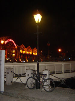
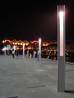
Every Saturday, he enjoys a nice night out at various Pubs around Singapore, savouring alcohol and making new friends. He dresses his best to impress, even though he really isn’t meeting anyone in particular. He enjoys the attention afforded to him. Once in a while, he will make attempts to chat with strangers too, no gender in particular. Occasionally, he gets recognised by former acquaintances or colleagues, and he indulges them in a conversation.

Matthias carries around with him, a name-card holder where he keeps the contacts of people he befriends at the pubs or throughout his course of work, most of the cards which he never took a second look ever since he kept them.

Wakeboarding, introduced to him recently by a casual drinking acquaintance is a sport which he enjoys as well. He loves the rush of the winds and waves hitting him as he makes turns and twists in the waters. Wakeboarding provides him with an adrenaline rush that his day-to-day work is unable to do so.

Physio
– Physical relaxation
– Intoxication
The recliner, the Saturday night alcohol. He indulges in physical comfort and the feeling of relaxation that the alcohol brings him.

Socio
– Shallow acquaintances
– Glamour
– Status
To him, everyone else is just a passing face and everything is like a passing phase. What gets him on is the moment of internal glee when someone recognises him or others talk greatly about him.

Psycho
– Stimulation
– Showy
He believes that packaging is everything. It is in his best interest to look the best and outshine others, to be at the centre of attention and have others admire him.

Ideo
– Go-getter
– Hedonist
He aspires to rise to the top of his work, to show others he is the best there is. Wakeboarding, more than just a sport to keep his body healthy, provides him with excitement and adrenaline rush. He enjoys the moment of doing the sport.

Products Benefits Specification

  • Chic, glossy chrome coating
    – Reflects a sense of sophistication in the user
  • Slim design without antenna
    – Doesn’t cause huge unsightly bulges when slipped into the pockets
  • Flip-cover phone where the cover-piece flips up with the press of a button
    – Showy mechanism that will grab attention
  • Glossy-black plastic inner-surface
    – Looks good but it may not necessarily be comfortable to be put against one’s face
  • Simple chrome-plated numeric keypad with 2 additional buttons for menu navigation and calling
    – Emphasises on the showiness of the buttons rather than the actual functions of them
  • Supports text messaging, calling, event-reminders
    – Not a high-utility phone, No special functions
  • Slide-casing employed for changing of batteries
    – Gives the look of a complete and seamless phone unlike the usual plain models with snap-on covers
  • Requires a specially-customised charging stand to charge the phone batteries
    – Designed to be a showpiece even when the phone is not in use
  • Hands-free function is poorly designed as it involves the same slide-casing for the batteries to be left half-opened
    – Not meant to be kept away from the view of others but instead used in its full glory next to a ear
  • Slight almost-ineffective grooves to facilitate gripping
    – Functionality of a proper grip sacrificed over the phone’s aesthetics (again)
  • Dim white backlight by default, able to adjust brightness of it
    – Provides just the right amount of illumination so that it does not come off as tacky
  • Smooth-sounding MIDI ringtones packaged with the phone
    – Crisp music to the ears, soothing and relaxing

Common LampThis post lacks pictures. I’ll get them up soon… I hope =)

So, I was thinking about how to get this assignment done and have it not revolve a handheld electronic product. I wanted something mundane for me to sprinkle excitement upon. I wanted something different. I chose… street lamps.

Visceral Lamp

Visceral Design
Classic lamp post design made up of an iron stand with an encased bulb. Why is this visceral you might ask? To me, it has the timeless feel to it. It is a light bulb of the past, one that could not have been born of our age, of our concrete jungle. Compare this with the common ones you see on the streets: Tall, drooping, plain and boring. You get the idea.

Behavioral: Doesn’t seem like such a great functional lamp if the only bulb in it blows…
Reflective: Nothing special in the design about this street lamp. Like I said, “iron stand with an encased bulb”.

Behavioral lamp

Behavioral Design
This one we find opposite the Ministry of Information, Communication and the Arts to me, has the “whole package”. It has multiple lamps, which will make it serve its function well to brighten the surroundings. It’s design is intricate, right down to its little details. This lamp post design to me, has the look-and-feel and is also functional.

Visceral: It’s actually similar to the Visceral Design above in terms of its “timeless” quality. But I would classify it more as Behavioral Design because of the multiple bulbs which caters for cases where one of the bulb blows…
Reflective: Nothing special again, really doesn’t make me contemplate about it.

Reflective Lamp

Reflective Design
These white columns standing between the Singapore River bank and the new mall, CentralĀ© are really street lights. It’s not the conventional type where you get a bulb in a glass jar. This one is more like putting an entire florescent tube in a glass tube. To me, it feels more like some classy ornament that should be in bungalows and semi-detacheds. Transplanting such an idea here gives the street a feel of sophistication, like I’ve just been transported to some art spot.

Visceral: It’s nothing like a conventional street lamp.
Behavioral: It has a great feel to it, since it looks classy and posh. Yet it doesn’t look all that functional about it…

Toilet Woes

So I am supposed to get a digital camera, take some pictures and capture user reactions for this assignment. Nope, no pictures here. Well, at least not for now. All you get is the following little graphic I came up with to represent what I am about to blog about…

There’s this nice little cafe near Clarke Quay train station where everything about it from the food to the service is excellent save the small and not-friendly toilets (Refer to the picture above). No photos here since I have not been back at the cafe for the past week and I don’t have archived shots of the cafe’s toilet.

Bad design I say, and testified by most of my friends who have also visited the cafe. Here’s a step-by-step process on how to use this particular toilet cubicle:

  1. Push the door so that it swings to its maximum range, which really is a limited range, as it is blocked by the toilet seat
  2. Enter the cubicle to position X, and pray you are of a small build and thin for if you are anything otherwise, it is going to get really uncomfortable
  3. Unless you possess telekinesis or like to close toilet doors with your back facing them, make a 180-degree turn at position X (Told you it would get a bit uncomfortable)
  4. Stretch out your hand, swing the door so that you get space to stand in between the seat and the door
  5. Close the door and lock it

Well, to get out, do the exact opposite of the above 5 steps in the reverse order (The English is not clear here but you should get what I mean).

Well, Qian Hao and his friend, Jaron, like me find the above-mentioned toilet cubicle design a very bad one indeed. We love this cafe, we really really really do, but the toilet design is bad. Period.

The cafe has 2 of such toilet cubicles built for the use of both genders. The cubicle is too small and awkward. I say let the door enjoy a greater swing and give more space between the swung door and the seat so that we don’t have to stay rooted at one tiny spot to make turns to close the door!

Precedence

First post coming soon…